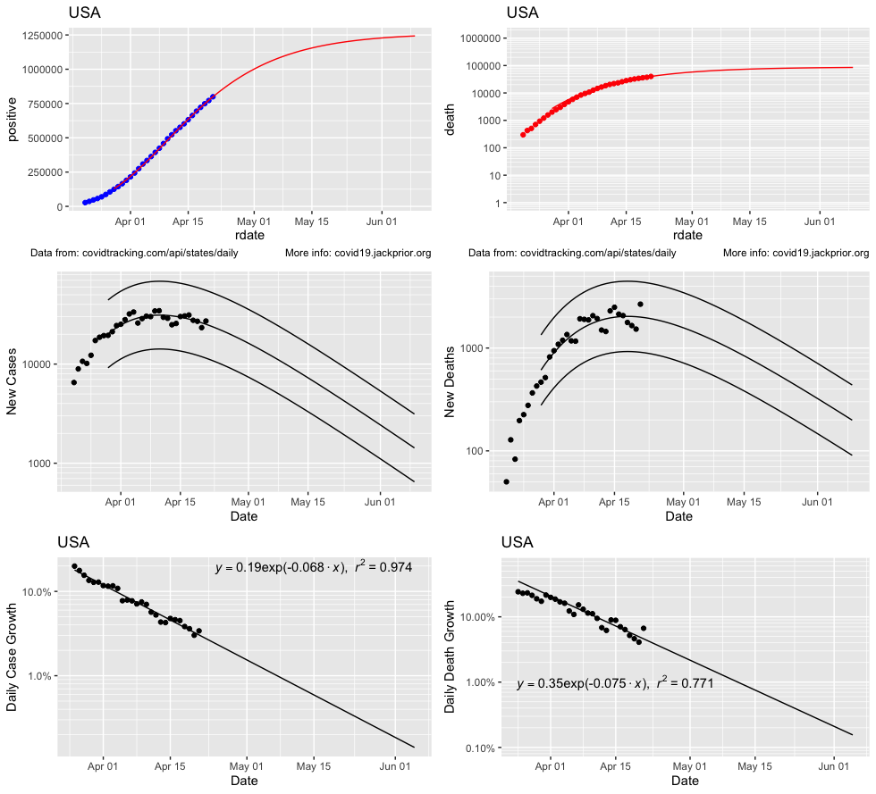
It is surprisingly hard to do things in R that are easy in Excel, but at least now it is automated using data from covidtracking.com. This is hot of the press and needs debugging and sensitivity analysis. I am not an epidemiologist and am just looking for simple patterns to extrapolate. Some of these projections seem unreasonable, or perhaps just depressing. In particular, the extrapolations for deaths seem too high for Massachusetts at the moment.
The key premise of these projections is that the daily % reduction in the case and death growth can be fitted with an exponential function and extrapolated. These trends have been steady for the USA overall, but more erratic on a state by state basis.
Projections assume that daily case reduction pattern will be sustained and not perturbed by the relaxation of social distancing.
These plots provide a sense of the community levels of Covid-19 that may be in place (and ready to inoculate 2nd wave) for various dates. The 2nd wave would grow at a much slower pace due to mitigations not in place in early March (e.g. masks, workplace and public place social distancing, handwashing awareness, crowd limits).
Error bars on daily cases are just for illustration and not calculated from data yet.
Note that projections are highly sensitive to the window used to fit the flattening rate. Some states have seen big recent changes in flattening (e.g. SD). This parameter currently this isn’t set to be consistent between the case extrapolations and the growth fit.
US Picture:
Cases forecasting to 1.25 million. Deaths to near 100,000. This seems plausible and is up from earlier projections due to increased testing and increased classification of deaths as Covid-19 related. It does point to a very high final CFR, so supports that testing is not keeping up with infections.
Cases and Deaths have peaked, but the slow decline from the peak leaves many new infections and deaths to come.


Massachusetts Picture:
Cases to 82,000. Deaths to 18,000. The death figure seems very high given cases have peaked and deaths are only at ~2000. It is also very inconsistent with the projected case total. Nevertheless, deaths have been climbing steadily at 10% per day, which is concerning. Behind this pattern is a steady climb in the observed CFR (2nd plot) suggesting the state is not keeping up with testing, but for these trends to both hold the CFR would need to rise to nearly 25%. .


Connecticut has a similar and even more striking trend in CFR, having climbed to 7%.


Newton, MA Picture:
Cases headed toward 600 500 cases. You can see the offset introduced by the sudden addition of nursing home cases on April 8th. The dip in weekend cases not showing up mid-week yet, so the newly calculated growth rate decline of -13% of rate /day is promising. Keep it up, Newton!

New York
Cases to ~320,000. Deaths to ~22,000.

Rhode Island
