There is a lot of discussion about the extent to which cases of Covid-19 are being underreported due to mild cases and at-home antigen tests. Only lab-based tests are considered in official reporting. While there are many papers on the topic, and I have to dig deeper into those, I have not seen the Massachusetts data analyzed quantitatively, so I had a go at it. Please note this is a quick arm-chair pre-breakfast Excel analysis and not a vetted academic study. Inferences about the data are speculative.
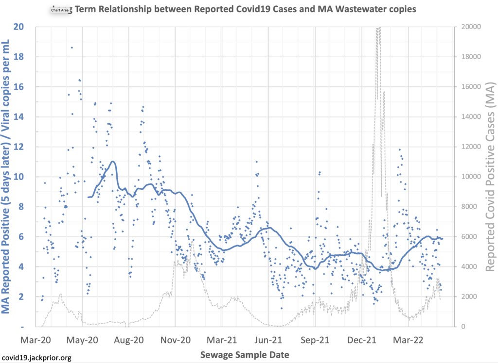
I downloaded the wastewater data reported by MWR and the reported cases from app.jackprior.org to see what the pattern is in the ratio of the two reported results. To smooth out the wastewater data I averaged the northern and southern data, filled the gaps, and then looked at 7-day averages. I shifted the case data back 5 days as that has been reported as the typical lag from wastewater signals to reported cases.
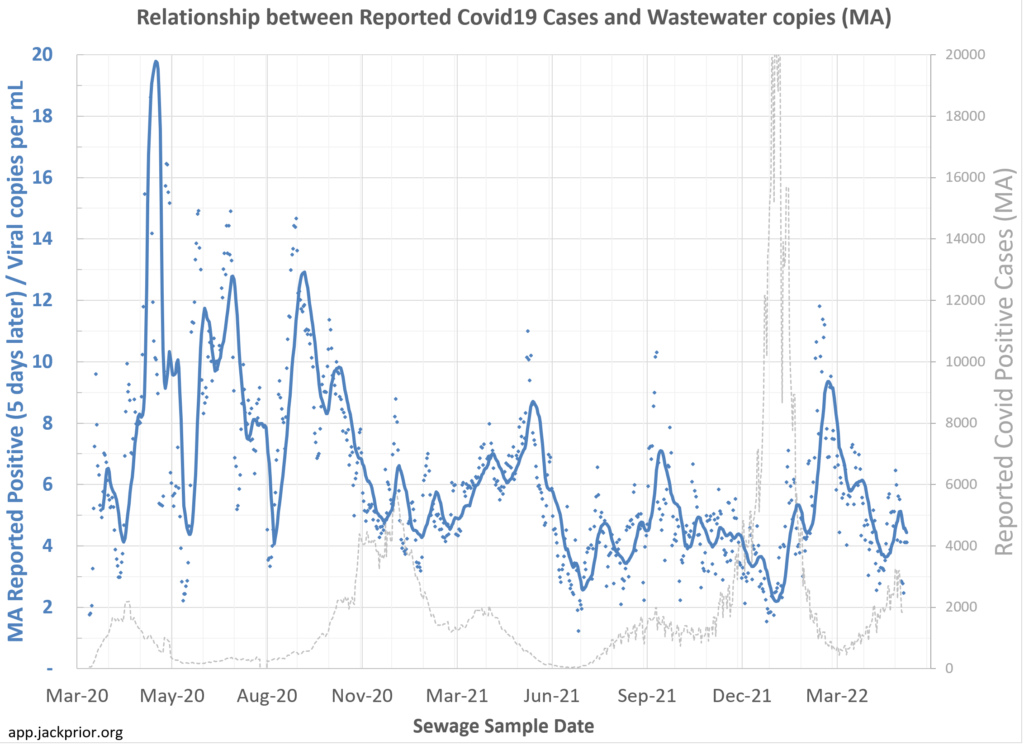
The data in blue is the number of reported cases in MA per day over time (shifted by 5 days to line up with wastewater data) divided by the copies per mL reported in the wastewater. The line is a 14-day moving average of the ratio. The data in gray is the total number of cases officially reported in MA.
So what does it say? Overall I would say the patterns are not as clear as people have described anecdotally.
Some of the unknowns and confounding factors:
- There is no particular moment that we can say that all, or nearly all, cases were being reported.
- We also don’t know the extent to which viral shedding per infected person varies by variant or the impact of vaccination on the degree of shedding.
- Wastewater only covers about one third of MA residents and is concentrated on eastern portion of stat.
At the moment Massachusetts is reporting about 4000 cases per day, and the wastewater has about 1000 copies per mL, so a ratio of around 4.
The case to virus concentration ratio peaked at 20 in mid-May 2020 and dipped as low as 2 at the height of the holiday Omicron variant wave in early January 2022. In mid-May 2020 our testing infrastructure was still constrained so even the 20 ratios likely reflect some underreporting even then.
The ratio approaching 2 in early January would suggest we may have been seeing only 10% of the actual cases reported in that post-holiday peak.
Now, the Dec-Jan period saw over 1 in 10 MA residents officially reported as infected, so 10% would mean everyone got infected, which is not realistic. So other factors are involved.
Interestingly though, as cases subsided in February, the ratio rose to near 10, suggesting as many as 50% of cases may have been detected.
The general pattern seems to be that there is a baseline of easily available and routine testing in normal settings (e.g. in pre-surgery tests), but as actual cases surge in the population, the more marginal cases are missed either due to mild symptoms or increased difficulty in obtaining an official test.
Looking at the longer-term moving average of the ratio over 3-month periods, the general pattern in the ratio seems to be roughly 9 in the pre-vaccination period dipping to roughly 6 in early 2021 and then 4-5 in late 2021, with a current average of around 6.
The interesting next step in this analysis would be to see if the estimated true cases line up with reported antibody results for the population over time.