As the countries and states start to move to reopen, the metrics by which these decisions are being made are not clear and not consistent.
Each region is going through an “S-Curve” of initial exponential growth followed by a flattening brought on by social distancing. Although many regions are beyond their peak, the degree to which they have moved their daily counts downward, and how fast that is happening, varies greatly.
We don’t want to move back into a burning building.
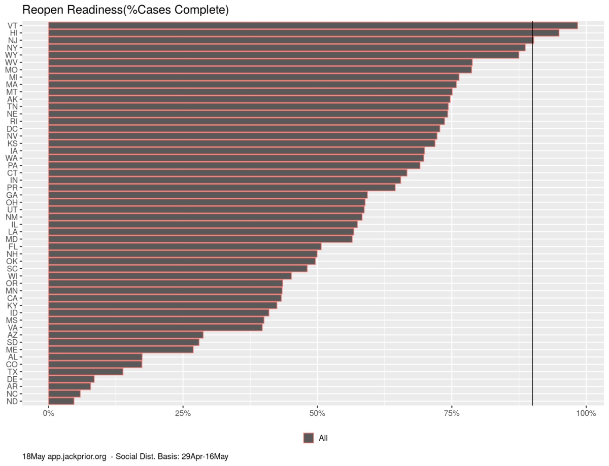
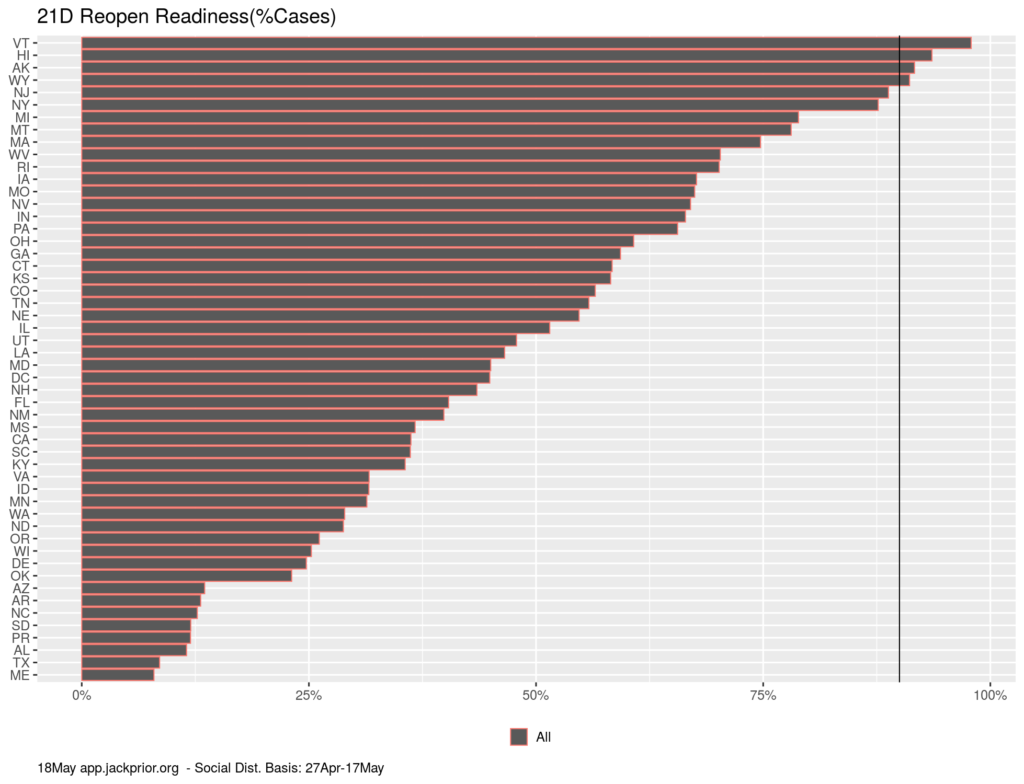
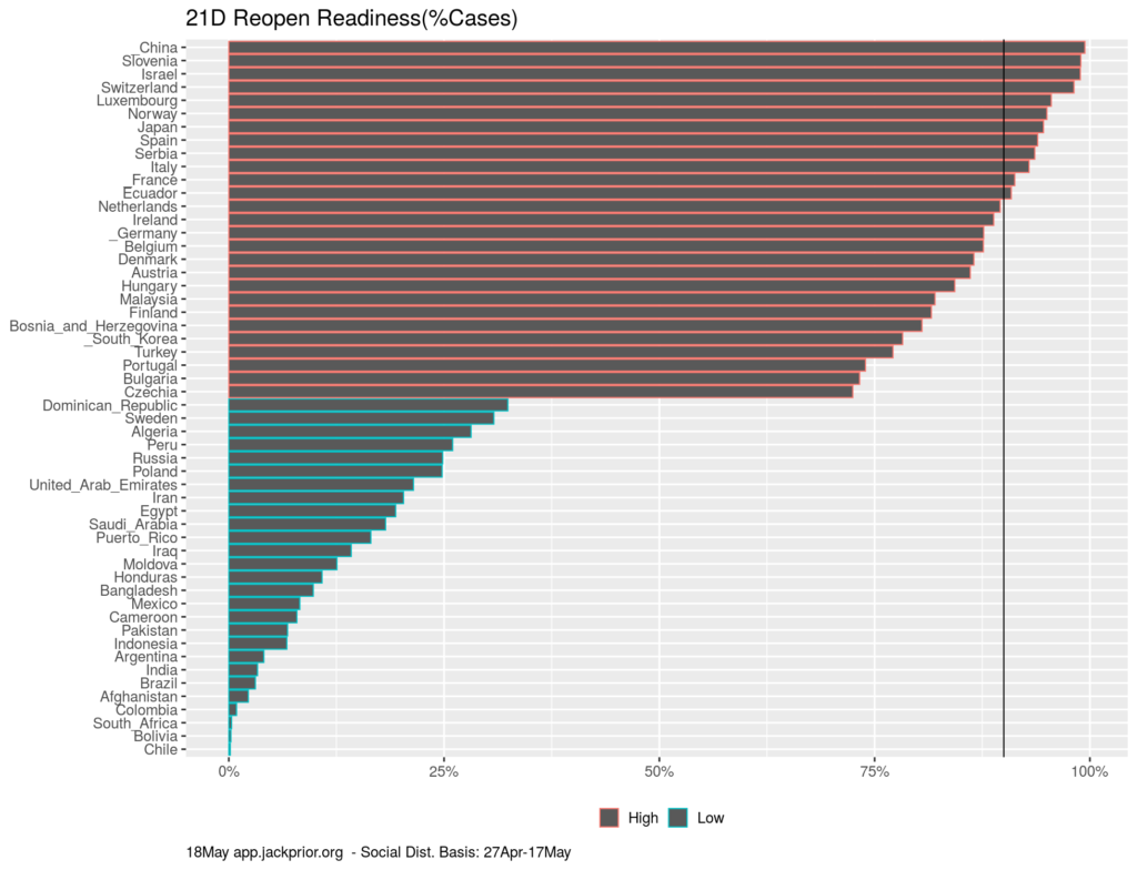
http://app.jackprior.org now has the ability to quantify how far each country and state has progressed through their S curve and rank them on that basis. This metric is available by choosing “Rankings”, “Cases”, “%Complete” (link). The metric is calculated by looking at the social distancing performance over the last 18 21 days and projecting forward three months for an estimate of eventual total counts under current distancing behaviors. Note this is a “hot off the press” metric and still being debugged for states/countries with irregular data.
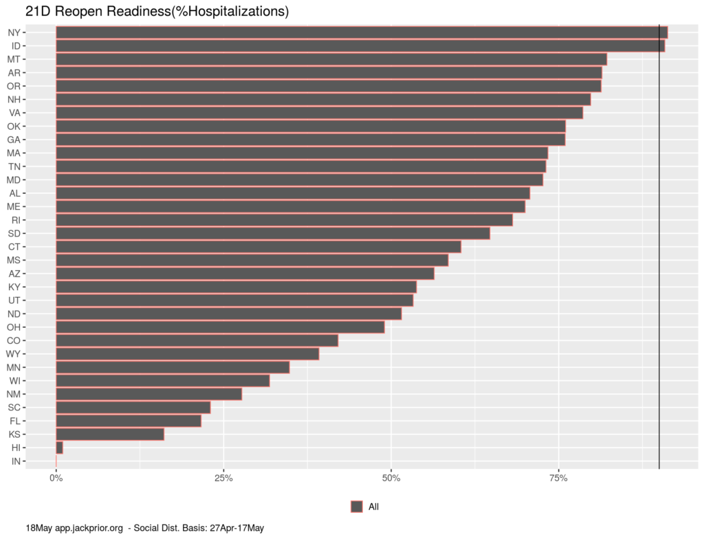
Here are the rankings for the US and the world. Currently, VT, HI, AK, and WY are more than 90% through their infection wave and NY and NJ are close. On the other hand, MA is only 75% of the way through its initial wave and is experiencing the 3rd highest per capita daily fatality rate in the world. If distancing is sustained, it is tracking to hit this 90% threshold around June 1st.
The world rankings provide a quick snapshot of the countries successfully battling the virus and those struggling.
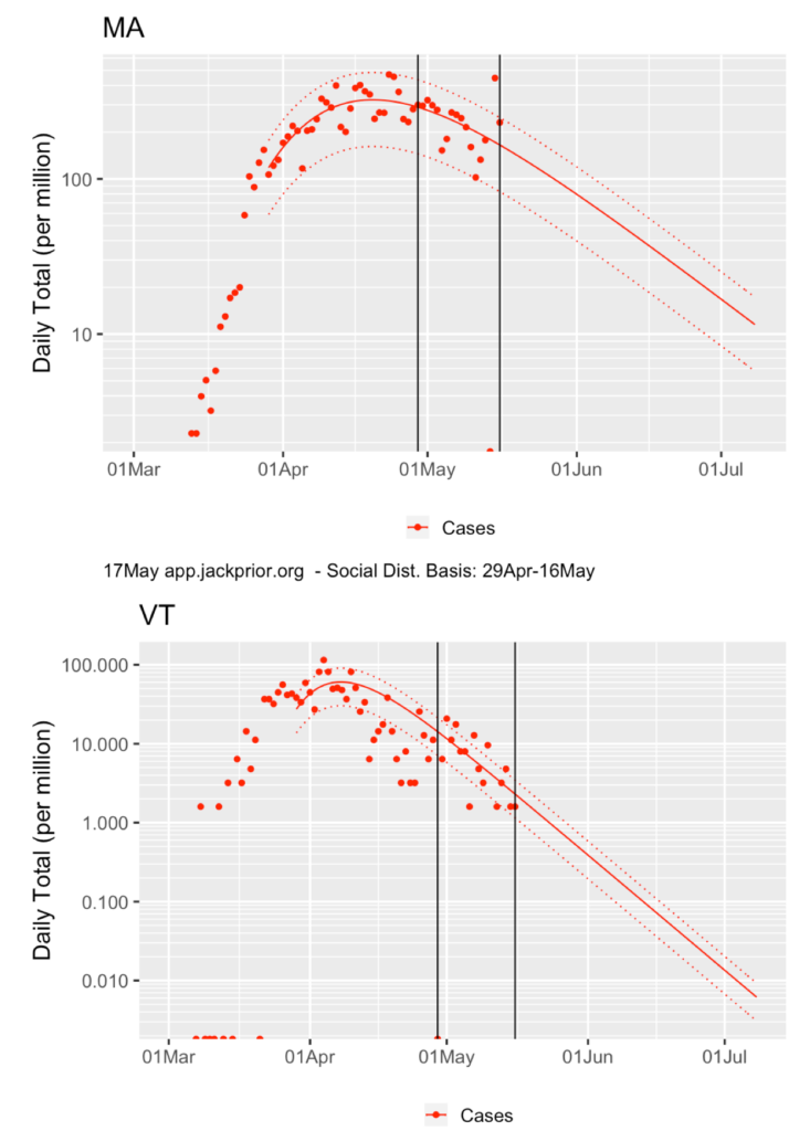
One can debate the precise percentage to mark as “ready”, but here is a comparison of the daily new cases in France and Massachusetts for example:
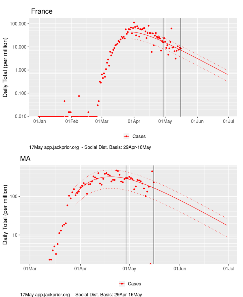
Massachusetts is seeing 180 new Covid-19 cases/day/million residents while France has reduced its infection rate to 9/day/million residents.
Here is a comparison of Massachusetts with Vermont:
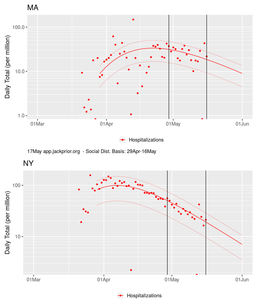
Another way to assess is to look at hospitalization data the same way.
Comparing NY and MA, you can see that NY has dropped from a peak level of hospitalizations of over 100/day/million residents to 20. MA is roughly at that level as well, but this represents the state’s demonstrated capacity for treatment thus far, and we are dropping more slowly.
This does raise a key question though on this metric. Is the absolute per capita level of infection more important than the trajectory a community is on? Many states in the US have somewhat uncontrolled situations, but at a very low level. Is their readiness less than an urban area coming down from a severe infection like NY?
TESTING
Another measure of reopening readiness is the degree to which a state is able to conduct testing. Below is show the current per capita ranking of daily testing by state:
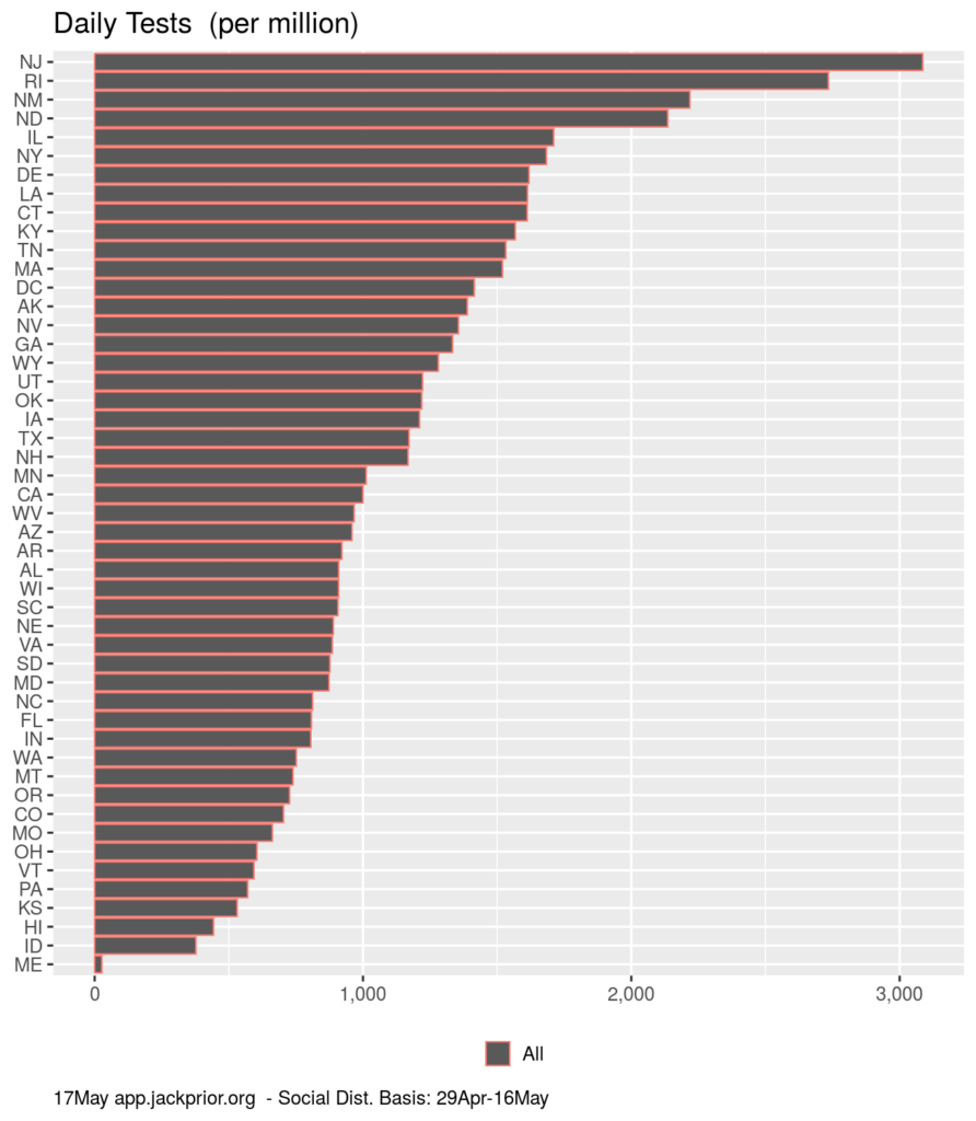
Public health officials can better judge the required level, but there is currently a range of 400 to 3100 test/day/million residents across the states.
One metric which helps in assessing if a state has sufficient testing is the degree to which it obtains negative results. The higher the positive rate, the more likely that testing is currently limited to highly symptomatic patients, although the higher baseline infection levels in different states impact the likelihood of positive tests as well. This is currently a cumulative metric and doesn’t reflect current incremental positives yet.
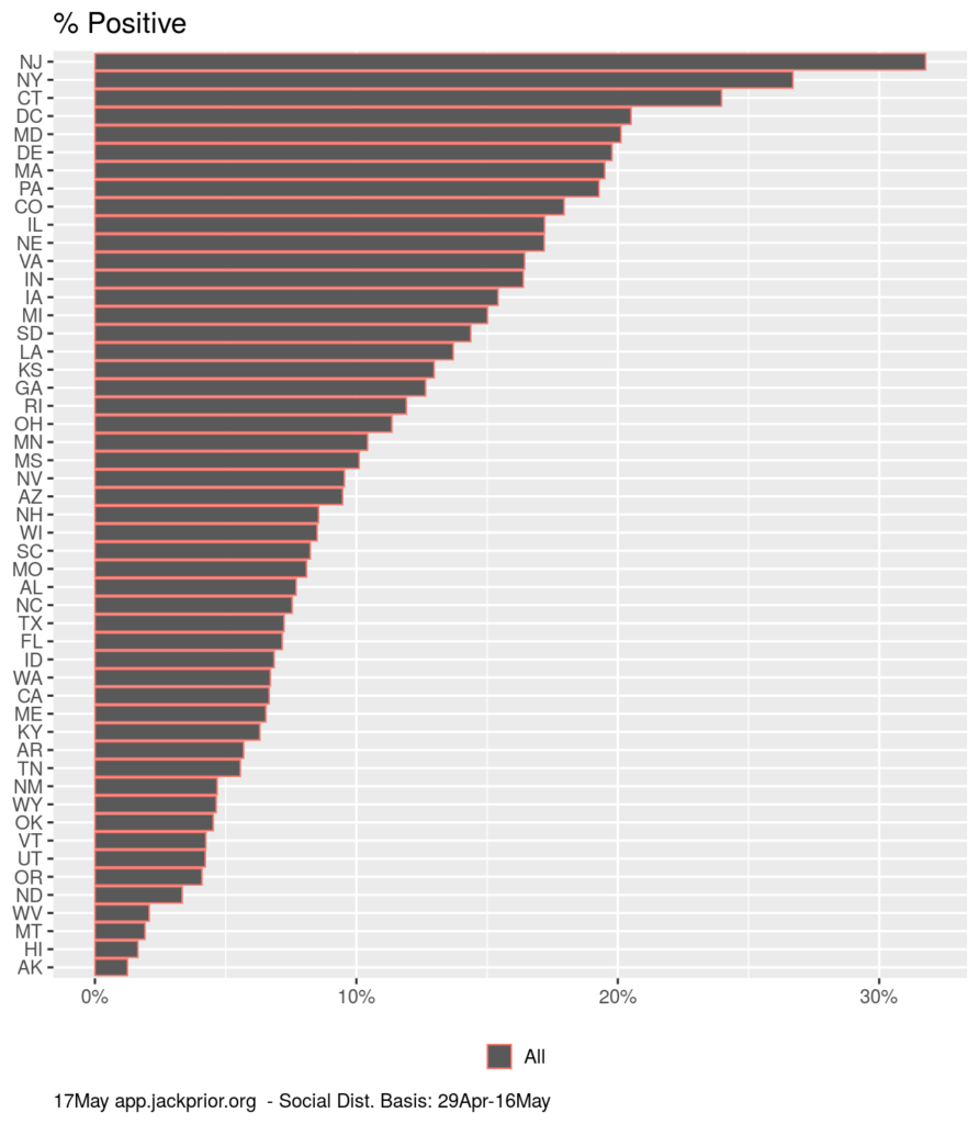
HI has a low positive rate, indicating they have sufficient testing, but also has a low per capita testing rate. Perhaps a better metrics would be the testing rate relative to the inherent estimated infection levels in a state?